plink2 --vcf data/gwas.imputed.chr20.dose.vcf.gz --double-id \
  --pheno data/phenotypes.txt \
  --pheno-name pheno_2 \
  --linear allow-no-covars \
--out output/gwasGWAS with PLINK2
This tutorial demonstrates how to perform a genome-wide association study (GWAS) using PLINK2, with and without principal component analysis (PCA) adjustment. We will use imputed genotype data obtained directly from the Michigan Imputation Server, which provides high-quality imputed datasets ready for association testing.
In this tutorial, we will:
- Load imputed genotype, phenotype, and covariate data
- Perform GWAS using PLINK2
- Compare association results with and without PCA adjustment
- Visualize findings using Manhattan and QQ plots
This workflow provides a complete introduction to conducting GWAS with imputed data, enabling accurate and efficient detection of genotype–phenotype associations.
GWAS on Phenotype 2
Phenotype 2 represents a continuous trait simulated to exhibit a strong underlying genetic component. Continuous phenotypes are commonly encountered in complex trait genetics, as they capture quantitative variation among individuals rather than discrete categories. Given the simulated genetic architecture of phenotype 2, we expected that genome-wide association analysis (GWAS) would reveal multiple significant loci contributing to the observed variation.
GWAS Without PCA
First, we run a linear regression GWAS on the simulated phenotype pheno_2 from the file phenotypes.txt, without adjusting for population structure. This initial analysis provides a baseline to observe how population stratification may influence the association results before including principal components as covariates.
Explanation:
--vcf: Input imputed genotype file in VCF format--pheno: Phenotype file (tab-delimited)--pheno-name: Selects the phenotype column to test (herepheno_2)--linear allow-no-covars: Runs linearr regression without covariates--out: Prefix for output files
After running the GWAS, we can visualize the results using Manhattan and QQ plots to better understand the distribution and significance of associations across the genome.
library(qqman)For example usage please run: vignette('qqman')Citation appreciated but not required:Turner, (2018). qqman: an R package for visualizing GWAS results using Q-Q and manhattan plots. Journal of Open Source Software, 3(25), 731, https://doi.org/10.21105/joss.00731.pheno_2 <- read.table("output/gwas.pheno_2.glm.linear", header = TRUE, comment.char = "")
pheno_2 <- pheno_2[!is.na(pheno_2$P), ]
# Manhattan plot
manhattan(x = pheno_2, chr = "X.CHROM", bp = "POS", p = "P", snp = "ID")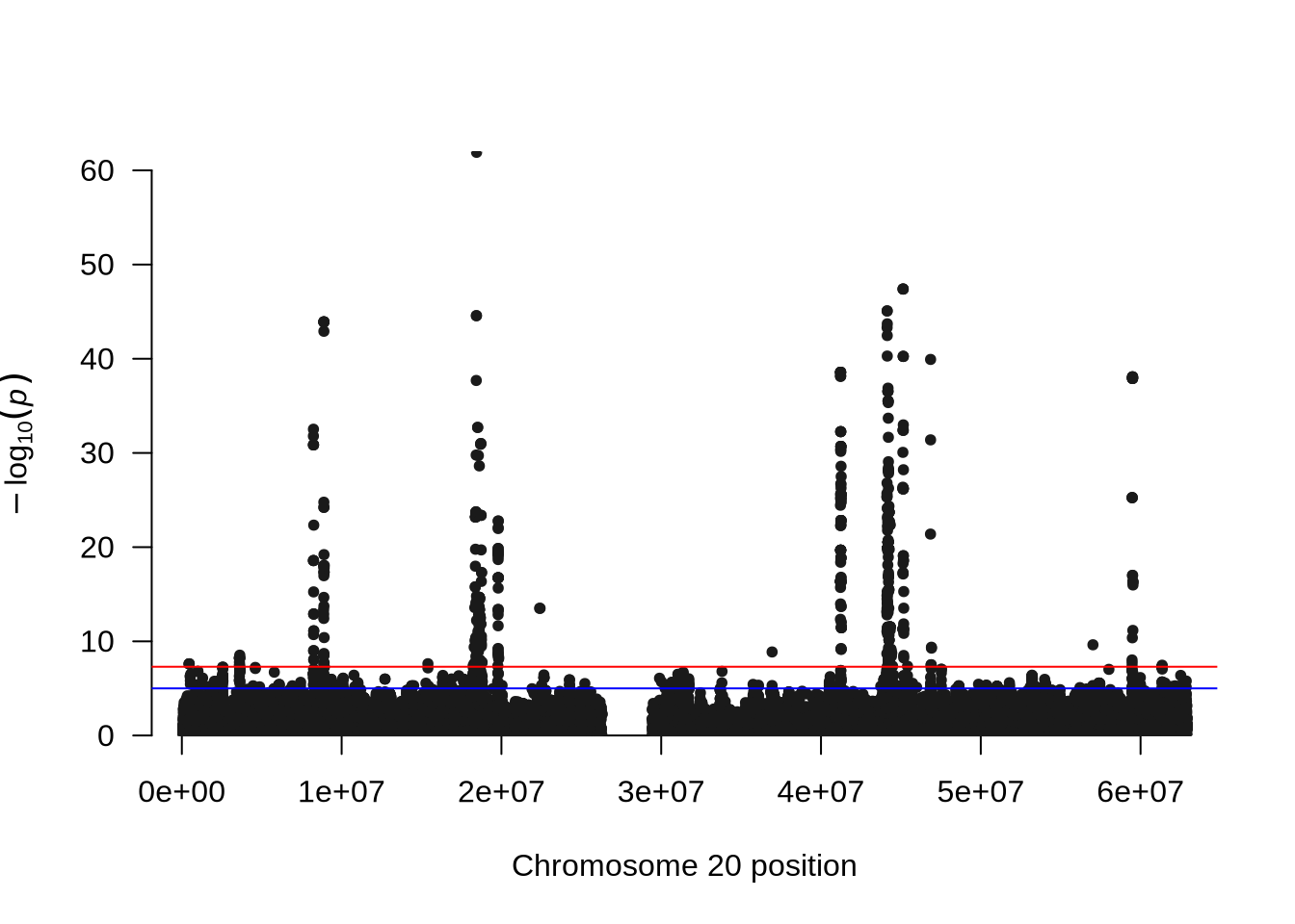
# QQ plot
qq(pheno_2$P)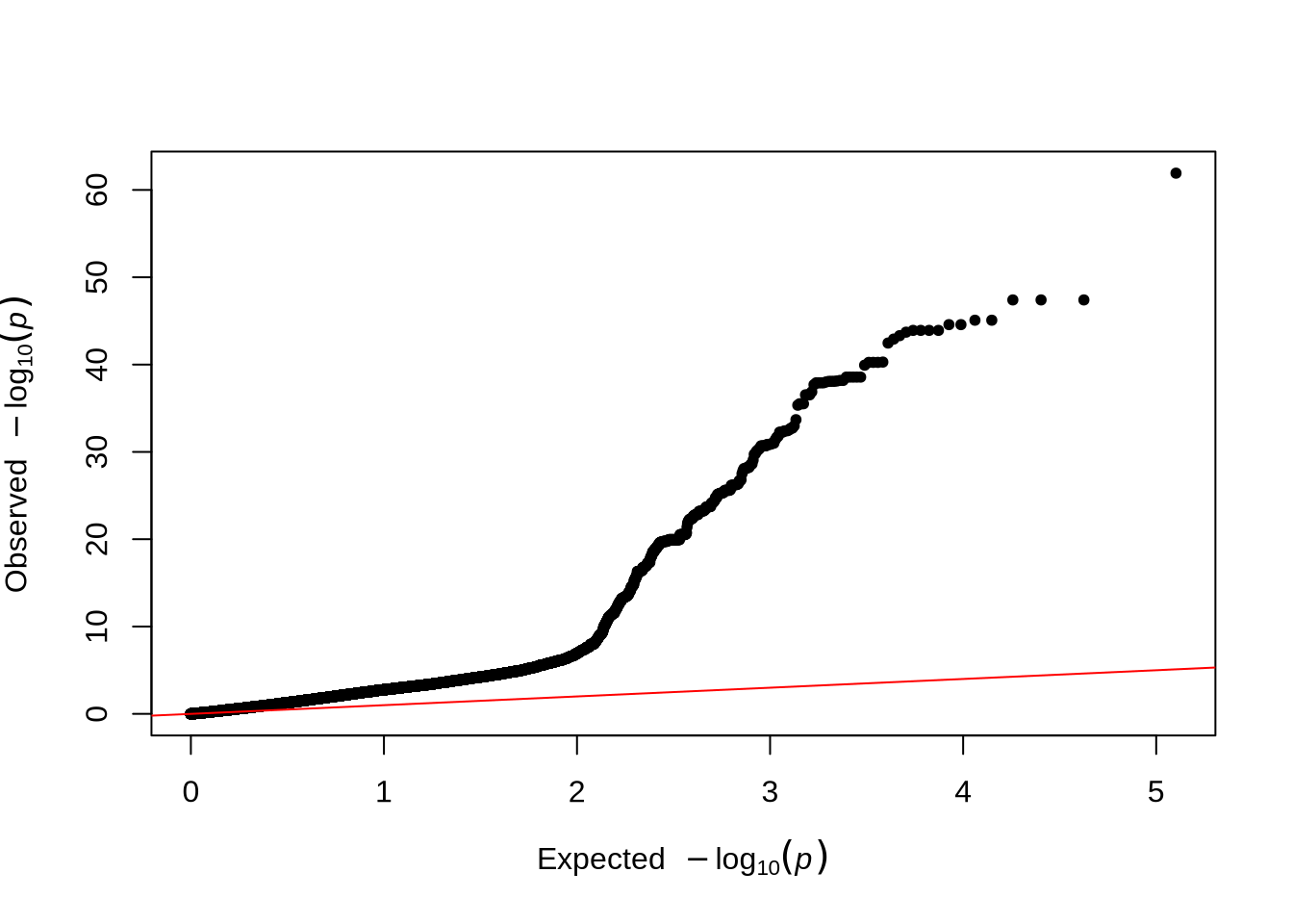
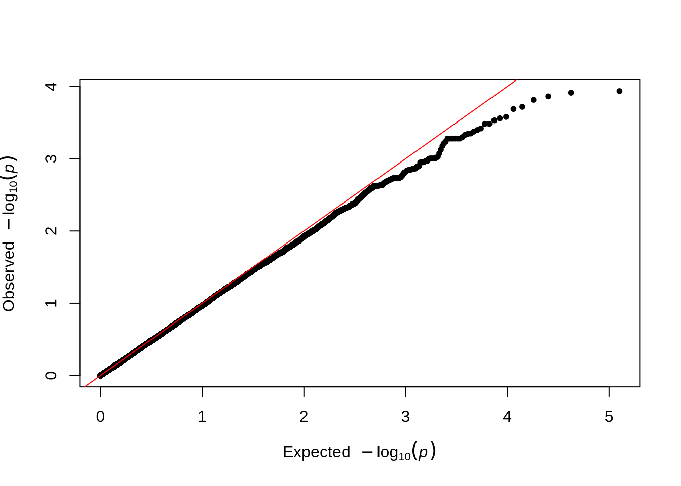
Notes:
- The
qqmanpackage provides convenient functions to visualize GWAS results. - The Manhattan plot displays all tested SNPs along chromosome 20, with the y-axis showing the –log₁₀(p-value). Peaks in the plot represent genomic regions with stronger association signals.
- The QQ plot compares the observed versus expected p-value distributions to assess potential inflation or systematic bias in the test statistics.
- In this unadjusted GWAS (without PCA correction), some inflation may appear, reflecting the effect of population structure or relatedness among individuals.
PCA: Assessing Population Structure
Before including principal components (PCs) as covariates, let’s visualize the PCA data.
library(ggplot2)

pca_data <- read.table("data/covariates.txt", header = TRUE, comment.char = "")

ggplot(pca_data, aes(x = PC1, y = PC2)) +
  geom_point(alpha = 0.7) +
  theme_minimal() +
  labs(title = "PCA of Genotype Data", x = "PC1", y = "PC2")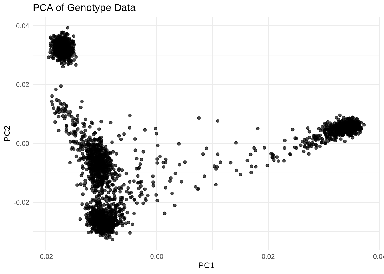
Explanation:
covariates.txtcontains individual-level covariates including PCs (e.g.,IID,PC1,PC2, …).- The PCA plot can reveal population substructure or outliers.
GWAS With PCA Adjustment
Next, include the PCA covariates in the GWAS to account for population stratification:
plink2 --vcf data/gwas.imputed.chr20.dose.vcf.gz --double-id \
  --pheno data/phenotypes.txt \
  --pheno-name pheno_2 \
  --covar data/covariates.txt \
  --linear hide-covar \
  --out output/gwas.covar
Explanation:
--covar: Provides a file containing covariates (e.g., PCs).--linear hide-covar: Runs linear regression while hiding covariate results in the output.
After running the GWAS, we can visualize the results using Manhattan and QQ plots to better understand the distribution and significance of associations across the genome.
pheno_2 <- read.table("output/gwas.covar.pheno_2.glm.linear", header = TRUE, comment.char = "")
pheno_2 <- pheno_2[!is.na(pheno_2$P), ]

# Manhattan plot
manhattan(x = pheno_2, chr = "X.CHROM", bp = "POS", p = "P", snp = "ID")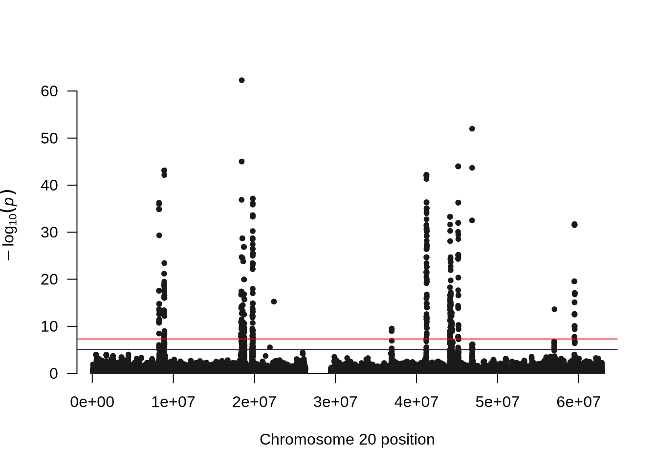
# QQ plot
qq(pheno_2$P)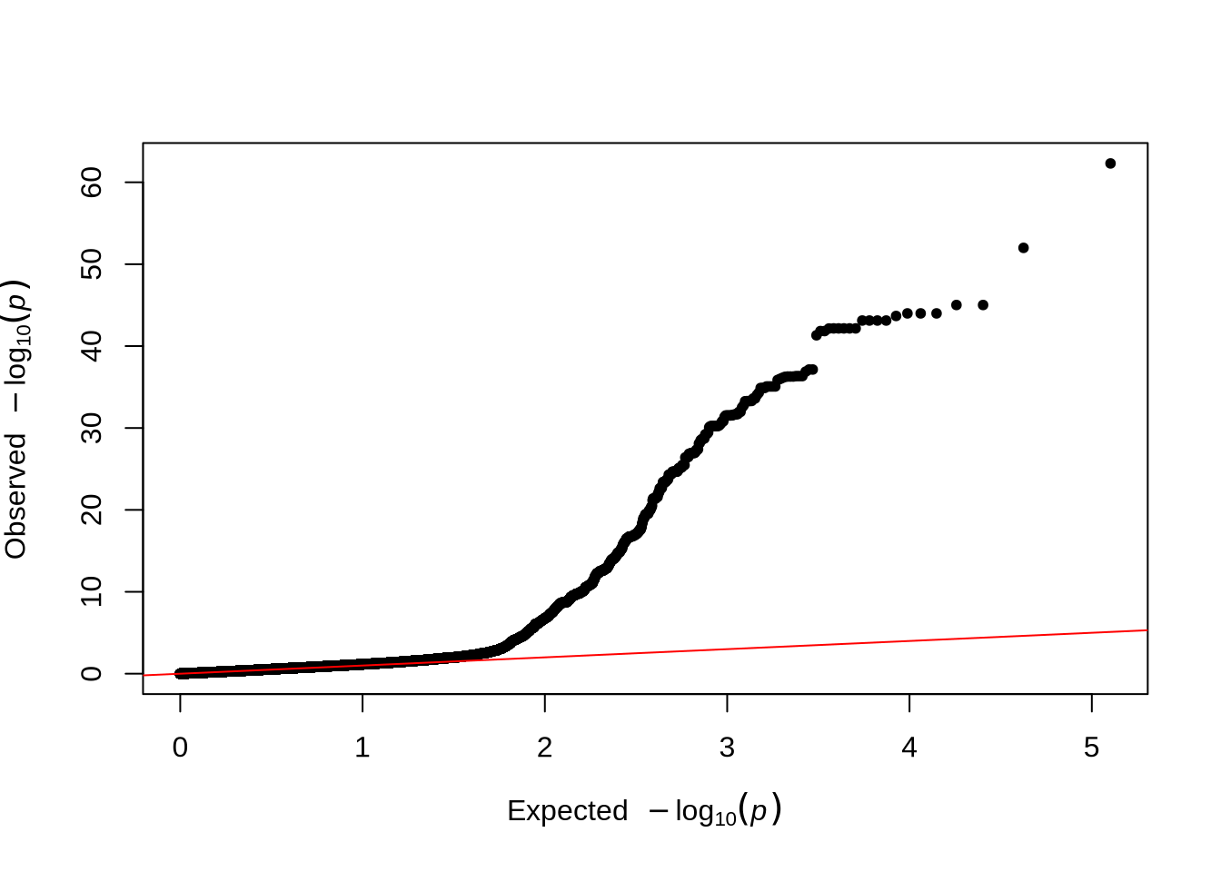
Comparison Tip: Compare the QQ plots before and after including PCs to see how population structure adjustment affects the inflation of p-values.
GWAS on Phenotype 4
Phenotype 4 was simulated as a continuous trait with no underlying genetic component. In this case, the variation in the phenotype arises entirely from environmental or random factors rather than genetic differences among individuals. As a result, we did not expect to detect any significant associations in the genome-wide association analysis (GWAS).
plink2 --vcf data/gwas.imputed.chr20.dose.vcf.gz --double-id \
  --pheno data/phenotypes.txt \
  --pheno-name pheno_4 \
  --covar data/covariates.txt \
  --linear hide-covar \
  --out output/gwas.covar
pheno_4 <- read.table("output/gwas.covar.pheno_4.glm.linear", header = TRUE, comment.char = "")
pheno_4 <- pheno_4[!is.na(pheno_4$P), ]
# Manhattan plot
manhattan(x = pheno_4, chr = "X.CHROM", bp = "POS", p = "P", snp = "ID")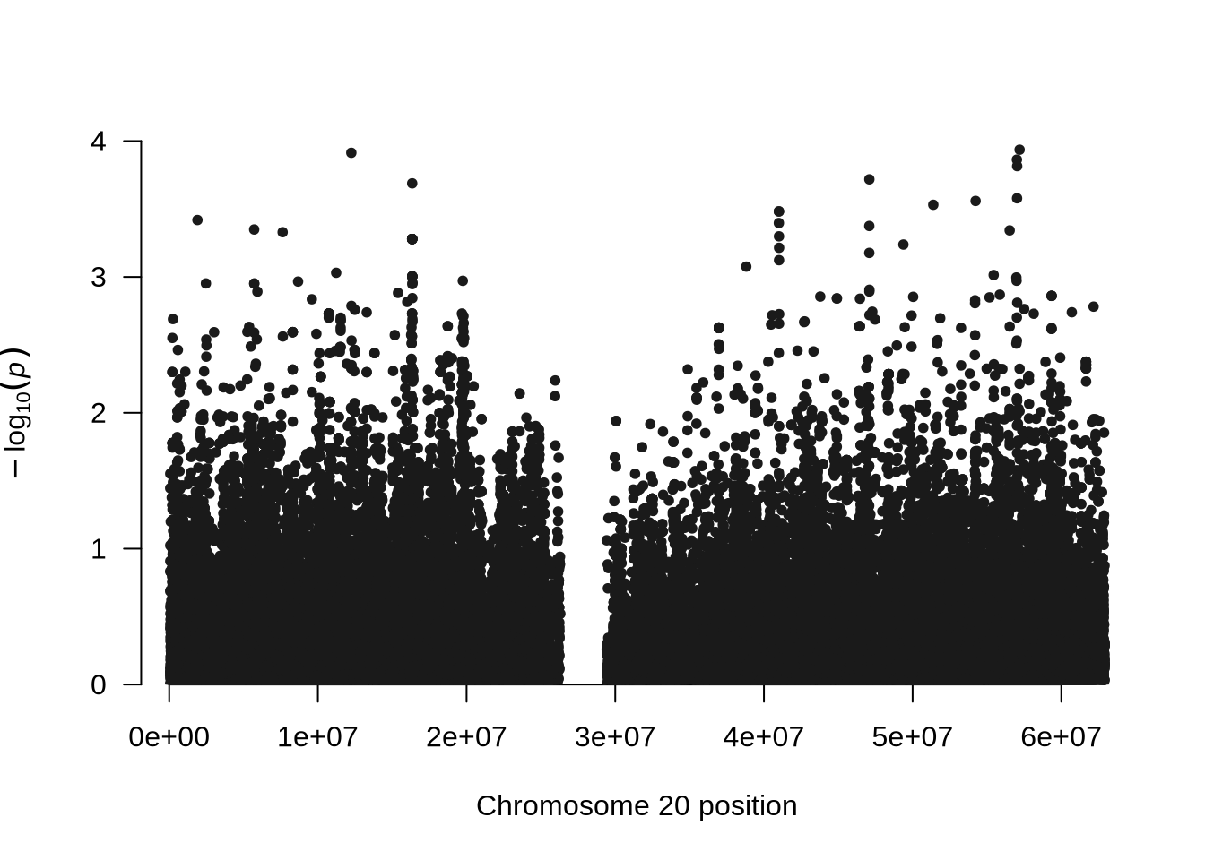
# QQ plot
qq(pheno_4$P)